Caso
Caso is an iGaming brand built around excitement, momentum, and reward. It combines betting and gaming into one fast-paced experience where every action feels immediate and engaging.
Context
Cashback exists in the product as a retention tool tied to user activity. It’s calculated from the difference between bets and wins, then adjusted by a percentage. The feature is already part of the system, but mostly presented as a static value within the interface.
Problem
The screen feels overly technical and hard to read. Users see numbers but don’t understand what they represent or how to influence them. There’s no clear next step, and the structure doesn’t help users connect their actions to the outcome.
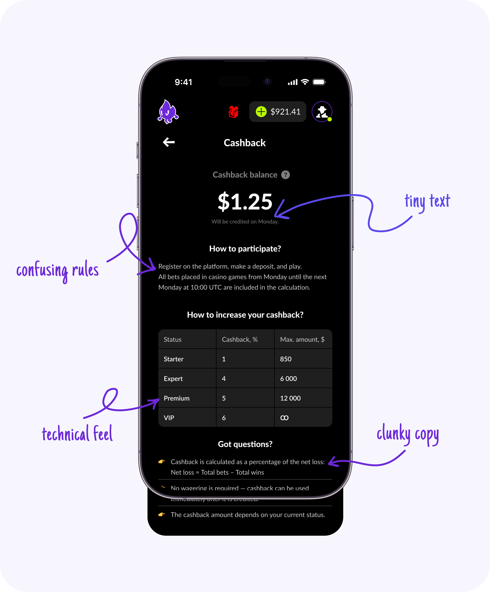
Initial cashback screen
Approach
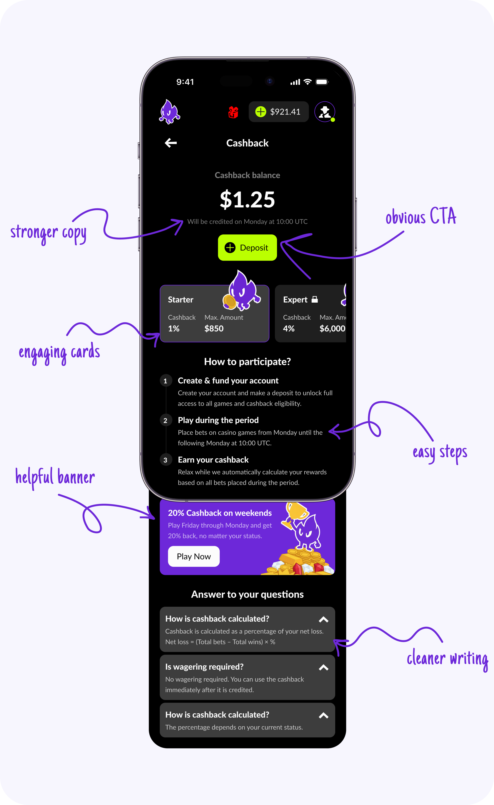
The redesign shifts the focus from raw data to user guidance. The idea was to make cashback easier to read, show how it evolves, and introduce simple actions directly on the screen. The interface starts explaining itself instead of just displaying values.
Balance
The top section became more direct and action-oriented. A clear CTA was added so users can move forward without leaving the screen. Time was localized, and typography was adjusted to make the information easier to scan at a glance.
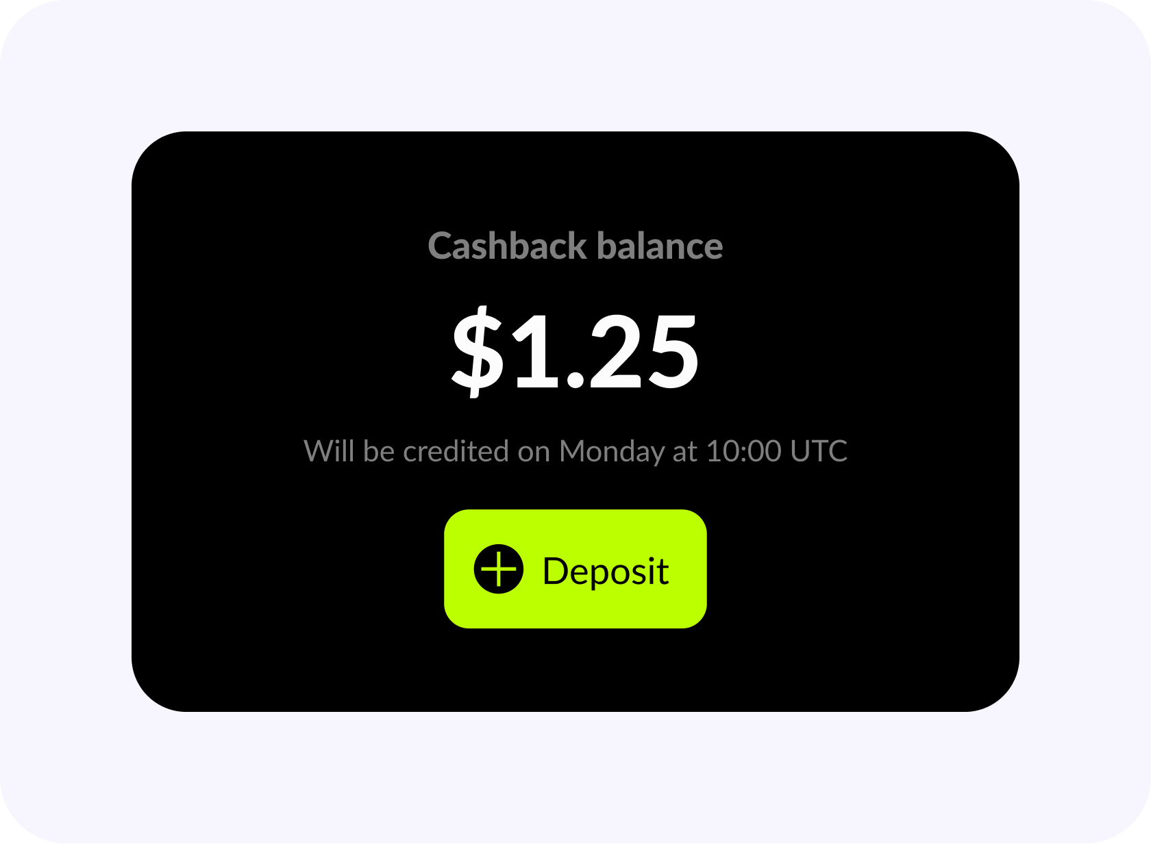
Updated balance section
User Levels
Levels were reworked to feel connected to cashback instead of existing separately. A simple visual progression with a character makes growth more visible. Each level adds detail, which helps users understand where they are and what comes next.
Redesigned level cards
How To Participate?
This section was simplified and reduced to essential steps. It became shorter and easier to follow, without extra explanations. The content also adapts depending on the user state, removing unnecessary steps like registration for returning users.
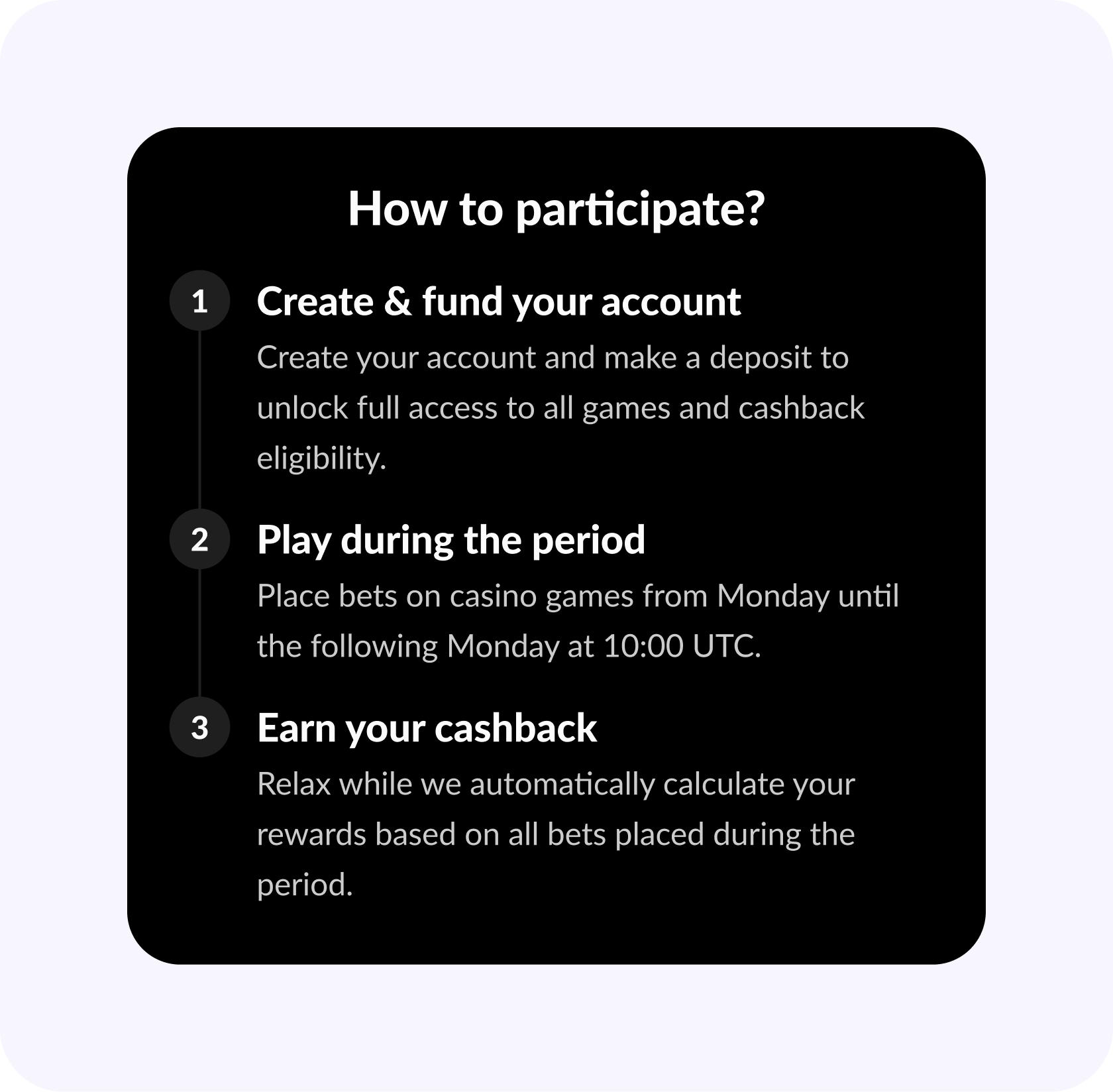
Simplified participation flow
Banner
A separate promotional block was introduced to highlight increased cashback. It stands apart from the main content and includes a clear call to action, making it easier to notice and act on.
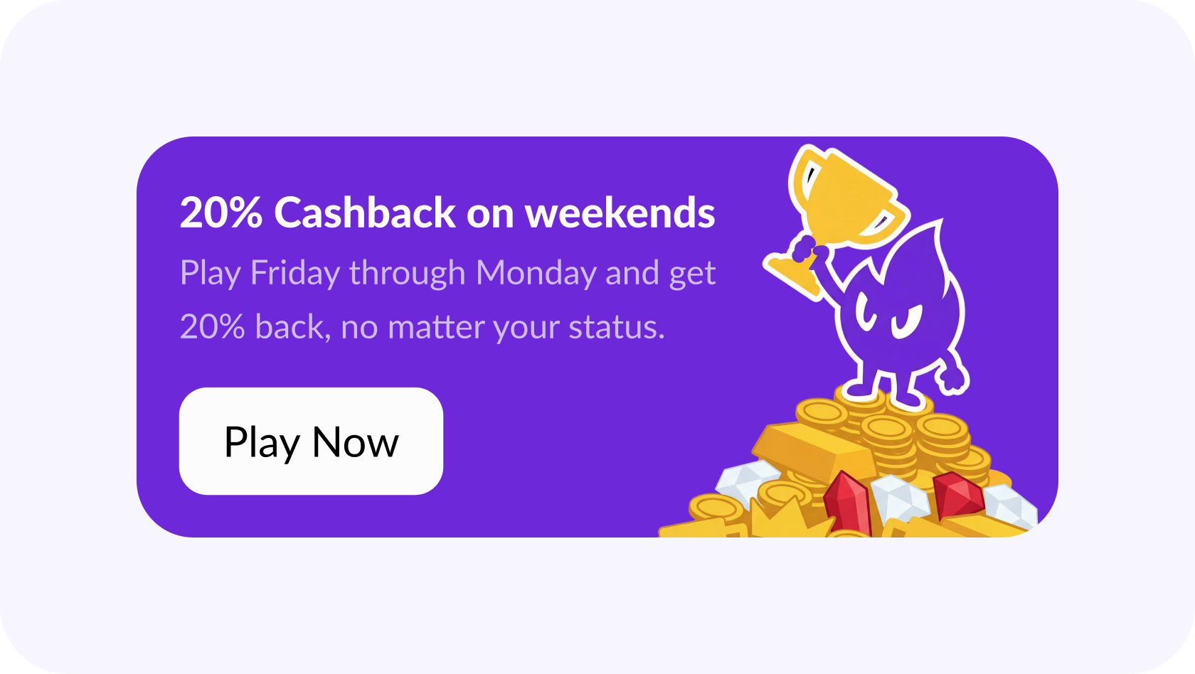
Cashback promo banner
FAQ
The FAQ was converted into an accordion. This keeps the screen cleaner while still allowing users to access details when needed. Information becomes less overwhelming but stays available.
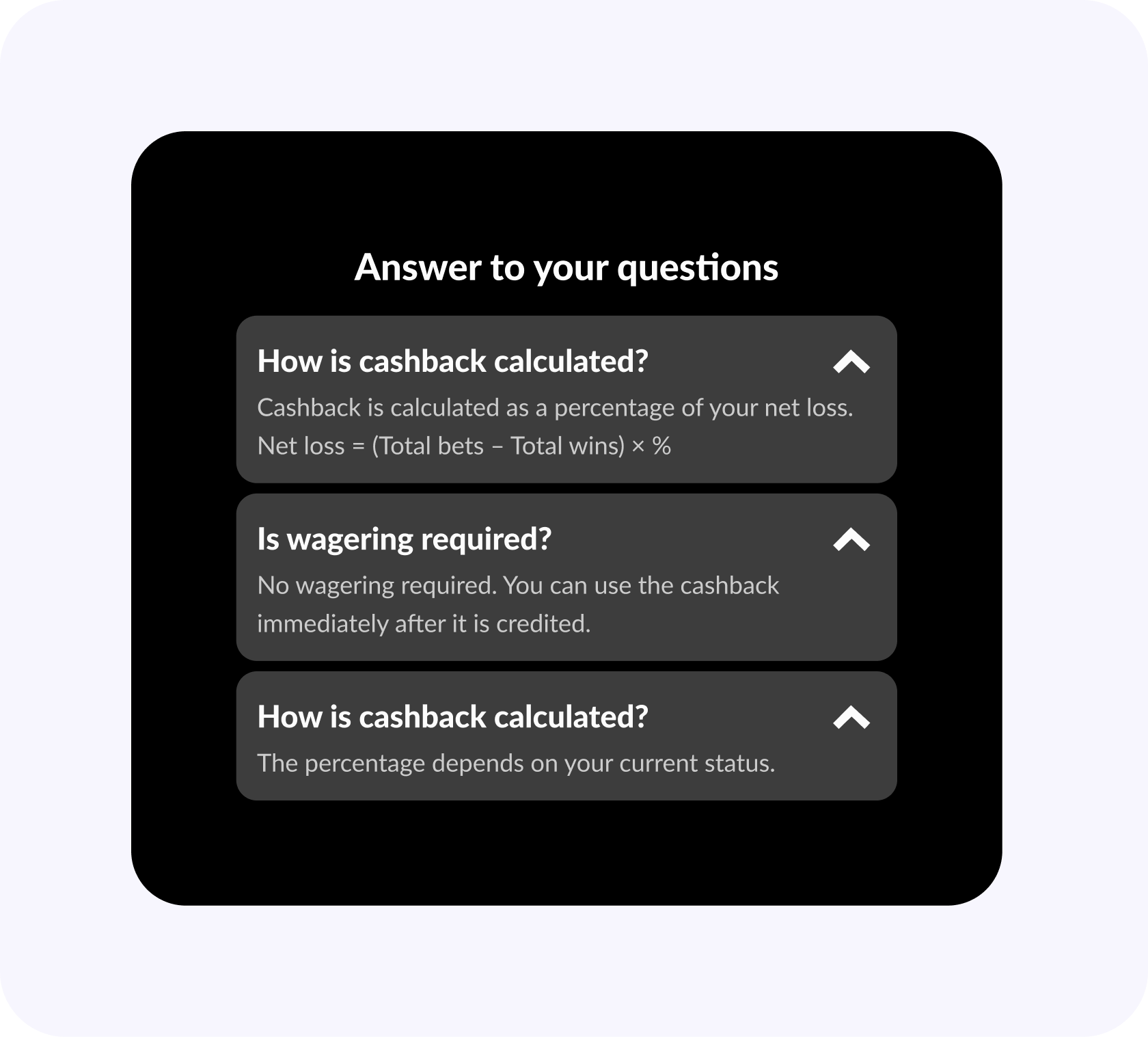
Accordion FAQ
Result
The screen shifts from a passive balance view to a more guided experience. Users better understand how cashback works and what affects it. Progress becomes visible, actions are clearer, and the interface feels more structured without adding complexity.
Final redesigned screen
Caso
Caso is an iGaming brand built around excitement, momentum, and reward. It combines betting and gaming into one fast-paced experience where every action feels immediate and engaging.
Context
Cashback exists in the product as a retention tool tied to user activity. It’s calculated from the difference between bets and wins, then adjusted by a percentage. The feature is already part of the system, but mostly presented as a static value within the interface.
Problem
The screen feels overly technical and hard to read. Users see numbers but don’t understand what they represent or how to influence them. There’s no clear next step, and the structure doesn’t help users connect their actions to the outcome.
Initial cashback screen
Approach
The redesign shifts the focus from raw data to user guidance. The idea was to make cashback easier to read, show how it evolves, and introduce simple actions directly on the screen. The interface starts explaining itself instead of just displaying values.
Balance
The top section became more direct and action-oriented. A clear CTA was added so users can move forward without leaving the screen. Time was localized, and typography was adjusted to make the information easier to scan at a glance.
Updated balance section
User Levels
Levels were reworked to feel connected to cashback instead of existing separately. A simple visual progression with a character makes growth more visible. Each level adds detail, which helps users understand where they are and what comes next.
Redesigned level cards
How To Participate?
This section was simplified and reduced to essential steps. It became shorter and easier to follow, without extra explanations. The content also adapts depending on the user state, removing unnecessary steps like registration for returning users.
Simplified participation flow
Banner
A separate promotional block was introduced to highlight increased cashback. It stands apart from the main content and includes a clear call to action, making it easier to notice and act on.
Cashback promo banner
FAQ
The FAQ was converted into an accordion. This keeps the screen cleaner while still allowing users to access details when needed. Information becomes less overwhelming but stays available.
Accordion FAQ
Result
The screen shifts from a passive balance view to a more guided experience. Users better understand how cashback works and what affects it. Progress becomes visible, actions are clearer, and the interface feels more structured without adding complexity.
Final redesigned screen